Design Case Study
Modular Mobiles
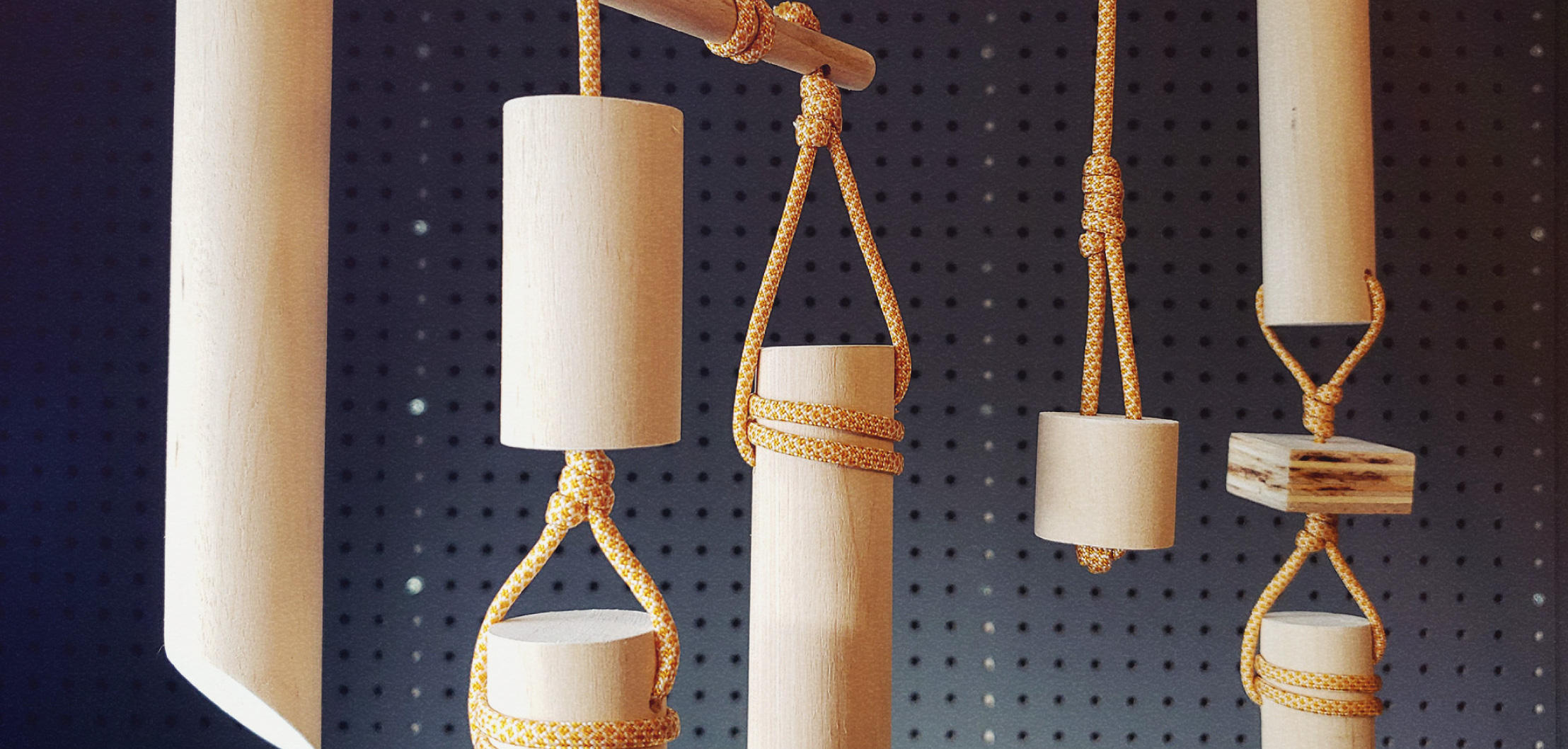
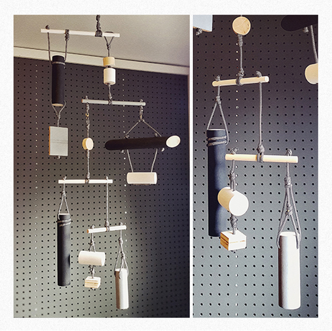
Hanging sculptural mobile artist, Modular Mobiles, needed a brand as funky and dynamic as their designs. Inspired by mid-century design elements from the era when mobiles were first invented, the overall aesthetic is playful yet deliberate.
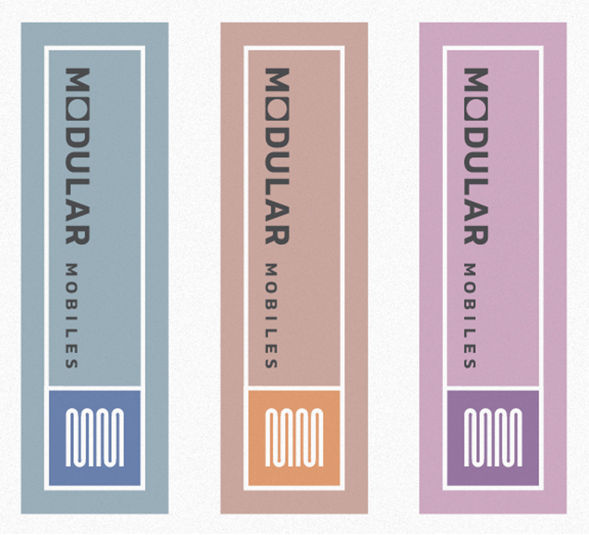
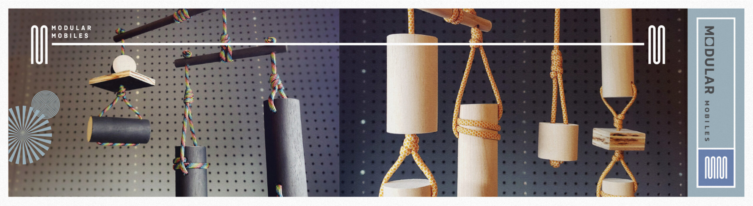
The branding starts with a design kit that mirrors the diverse colors and playful layouts of the mobiles. Each design application features bold photography, complemented by a color-coordinated ribbon and fun, decorative, optical-inspired illustrations peppered on like visual seasoning.
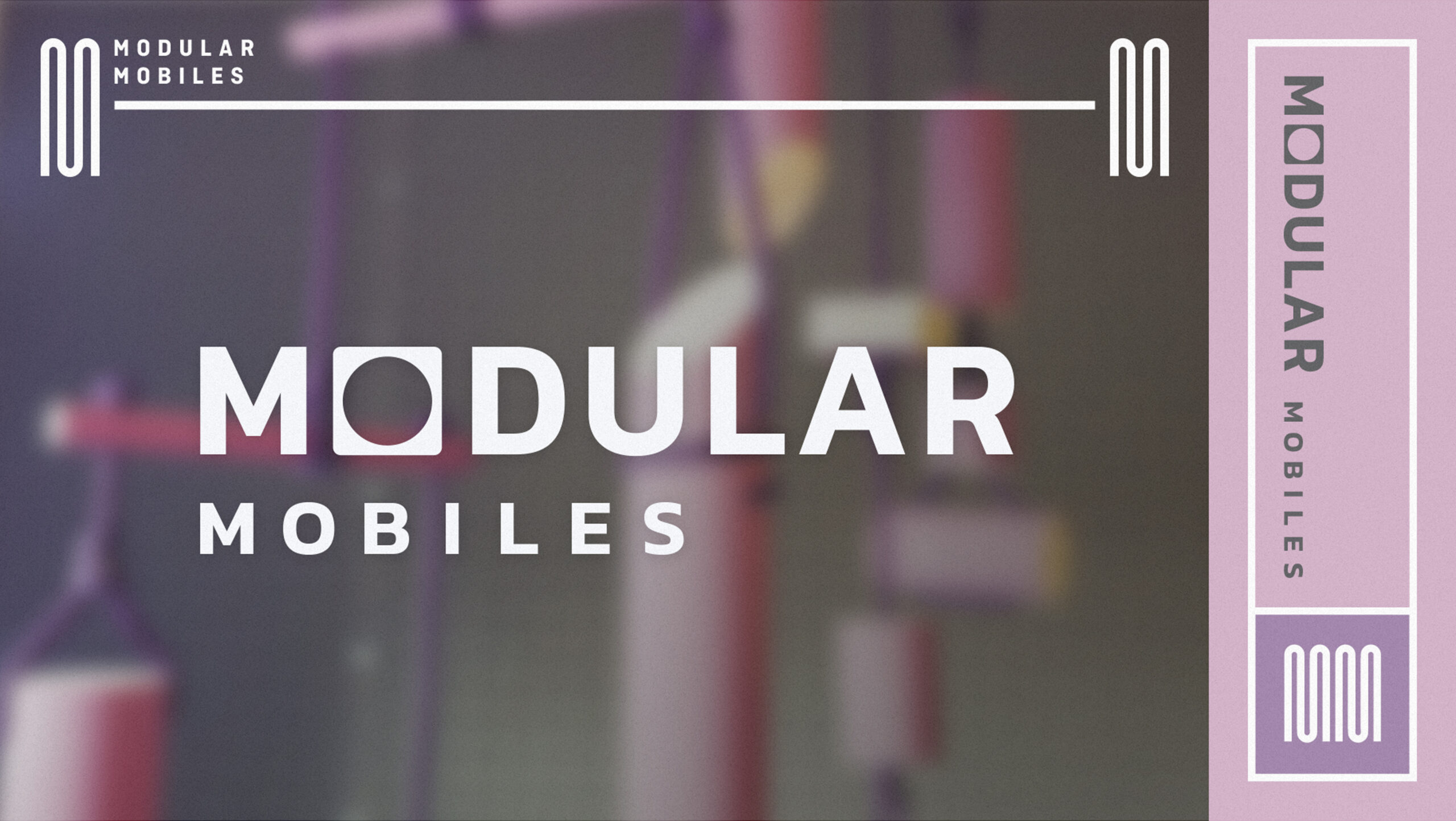
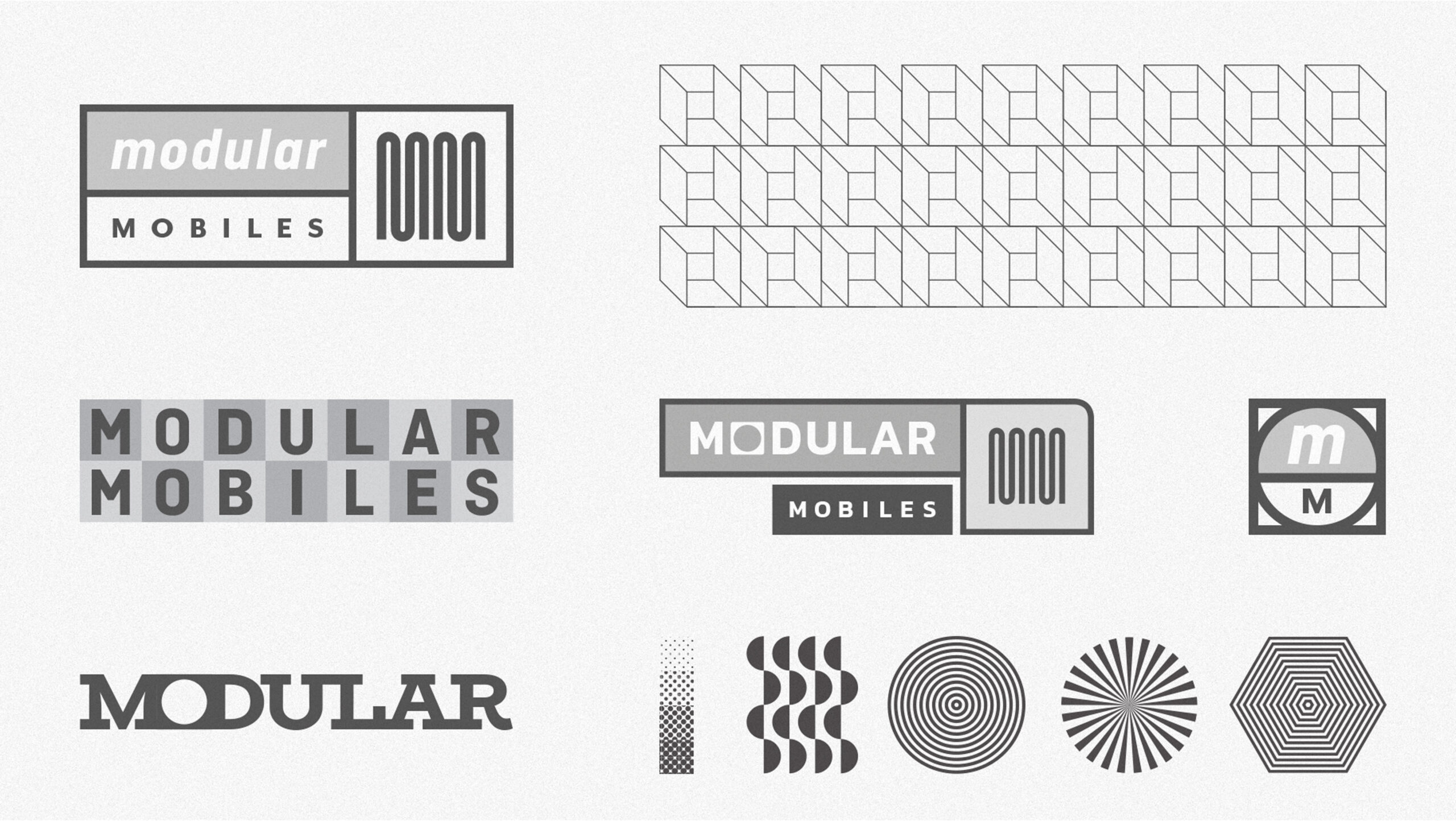
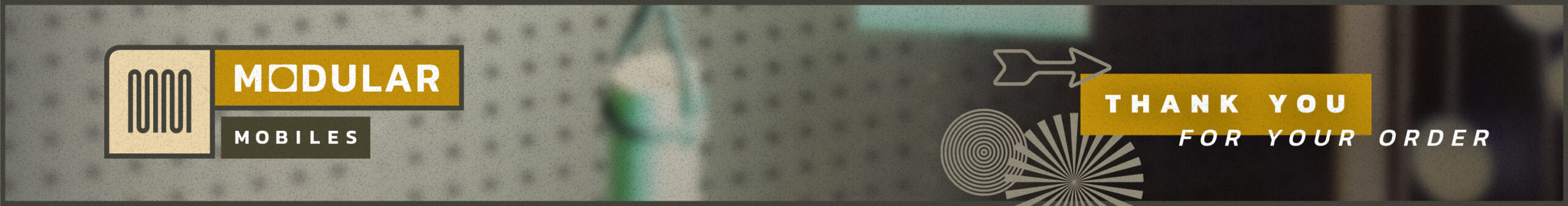
Leveraging the alliterative double-M, the logo mark has a strong vertical stress and repeated forms similar to the wooden dowels of the mobiles. The M shapes, like repeated modules all their own, can then be separated and metaphorically “hung” from the ends of a crossbar from the top of pages, symbolizing the balanced mainstay of mobile design. In true modular form, this crossbar can scale to fill the width of design application.
The word mark showcases an “O” in a square nestled between two squared letterforms, suggesting the fitting of modular parts within a system as well as adaptability to different contexts. To add subtle character and evoke a pre-digital era, an overlaid film grain texture ties elements together. The designs speak a unified modular language while allowing each piece to remain distinct, incorporating clever “modular” elements that can be scaled and adapted across various applications.
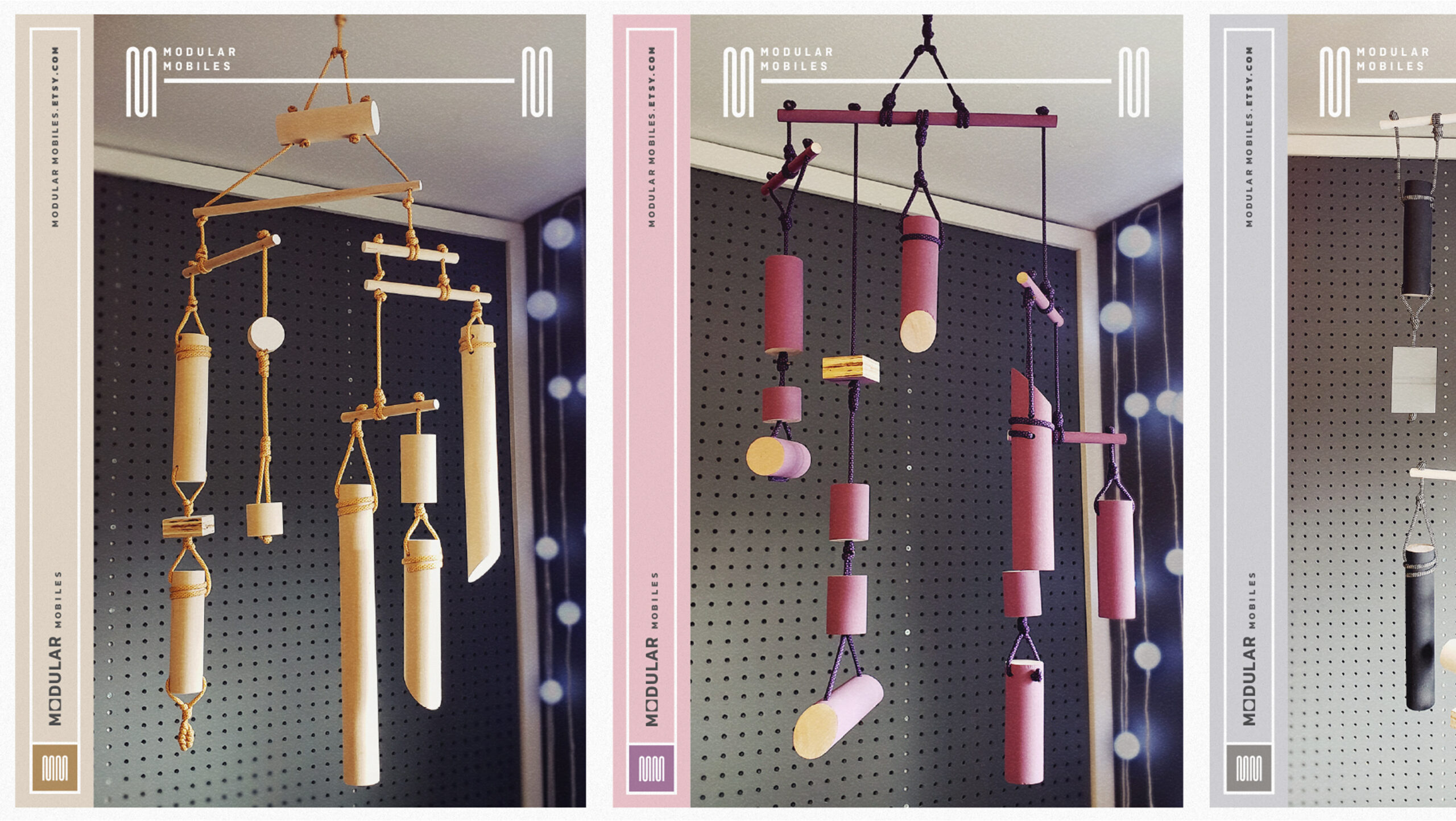
Ad layout exploration and final design

Ride that wave to your new project!
Let's connect the dots and bring your vision to fruition and even to the next level!
write to BOB